Documentation
Getting Started
This guide will help you get started with Hospital Management! All the important stuff – compiling the source, file structure, build tools, file includes – is documented here, but should you have any questions, always feel free to reach out to OwnIT
If you really like our work, design, performance and support then please don't forgot to rate us on Themeforest,
it really motivate us to provide something better.
Please Note :
- All images are just used for Preview Purpose Only. They are not part of the template and NOT included in the final purchase files.
Installation Setup
To get started, you need to do the following:
- Installing Grunt: Run
npm install grunt --save-devcommand from your teminal to install grunt within your project. - Grunt Sass: Run
grunt sasscommand from your project directory. It will compile SASS to CSS for the project. This will read the file `scss/filename.scss` and output a plain-css file to `dist/assets/css/filename.css`. - Grunt JSHint: Run
grunt jshintcommand from your project directory. It will checks all *.js files under `assetsjs/filename` for common syntax or coding errors using the JSHint utility. - Grunt Sprite: Run
grunt spritecommand from your project directory. - Further help: To get more help on the grunt checkout Grunt
- Note: However, any SASS code you write must be able compile via Grunt as well.It will generate pre-compiled javascript templates. Reads all the *.html files from `assets/js/filename` and outputs `assets/js/filename.templates.js`. Template.js will contains code of UI design and will be change each time you build solution through above command.
Grunt is a JavaScript task runner, a tool used to automatically perform frequent tasks such as minification, compilation, unit testing, and linting. It uses a command-line interface to run custom tasks defined in a file.
File Structure
-
dist - Generated production files
-
assets
- bundles - Bundling plugins JS file
- css - Compiled CSS
- fonts - Icon font and font awesome
- images - Image assets
- plugin - plugins JS and css file
-
ui-elements- Ui-Elements using Customized app
- Index.html - All Html file like Authentication,UI Components,Changelog etc...
- Index.html- Hospital Management Html Template
-
assets
-
documentation - Project documentation
-
assets
- css - Compiled CSS file
- fonts - Icon font and font awesome
- images - Image assets
- js - Compiled JS file
- plugin - plugins JS and css file
- index.html - well project document
-
assets
-
js - Javascript source
- page - Page js file
- template - Common js file
- node_modules - NPM dependencies (by default the folder is not included)
npminstalls dependencies. -
scss - SCSS source for theme
- bootstrap - Custom bootstrap components
- generic - Animation, Helpers class
- global - variables, themes, mixins
- plugin - all plugin scss file
- skeleton - layout separate file
- widgets - All widgets file
- main.scss - Project main scss file
- Gruntfile.js - All the build commands
- package.json - List of dependencies and npm information
- .gitignore - Hide all unnecessary files from Git
Layouts info

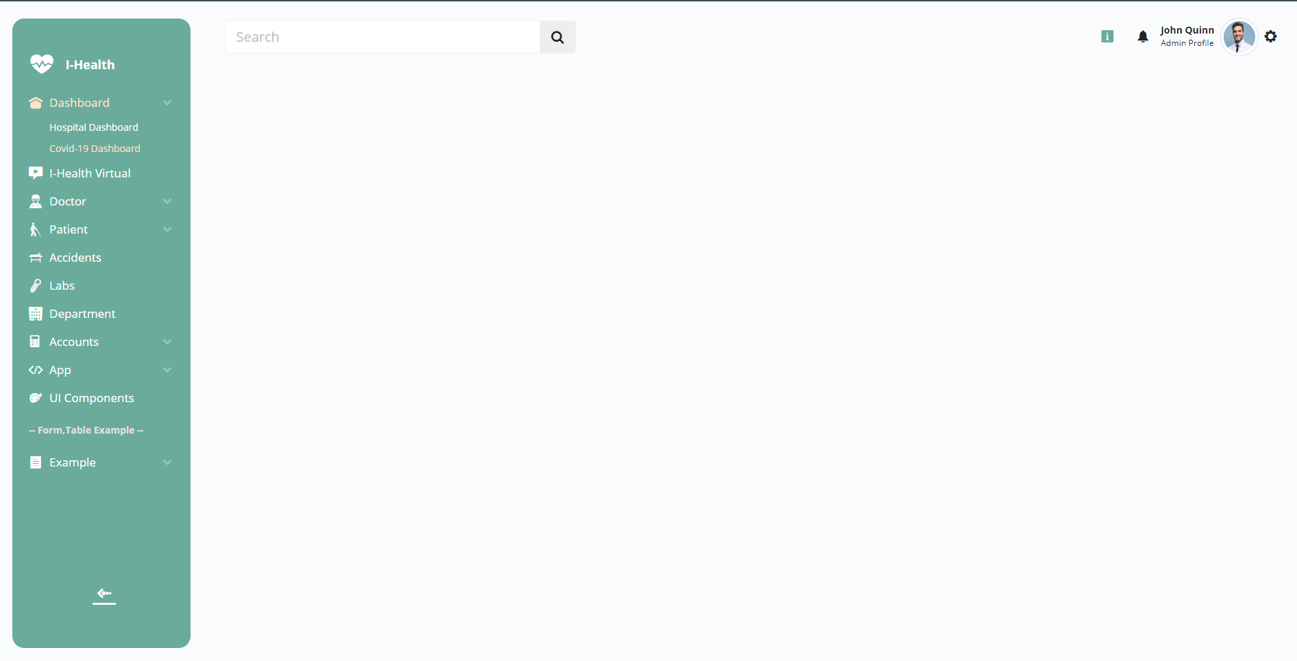
Bydefult Menu Open Code
    <div class="sidebar px-4 py-2 py-md-4 me-0">
        <div class="d-flex flex-column h-100">
            <!-- Main Logo -->
            <a href="index.html" class="mb-0 brand-icon">
            </a>
            <!-- Menu: main ul -->
            <ul class="menu-list flex-grow-1 mt-3">
            </ul>
            <!-- Theme: Switch Theme -->
            <ul class="list-unstyled mb-0">
            </ul>
            <!-- Menu: menu collepce btn -->
            <button type="button" class="btn btn-link sidebar-mini-btn text-light">
                <span class="ms-2"><i class="icofont-bubble-right"></i></span>
            </button>
        </div>
    </div>

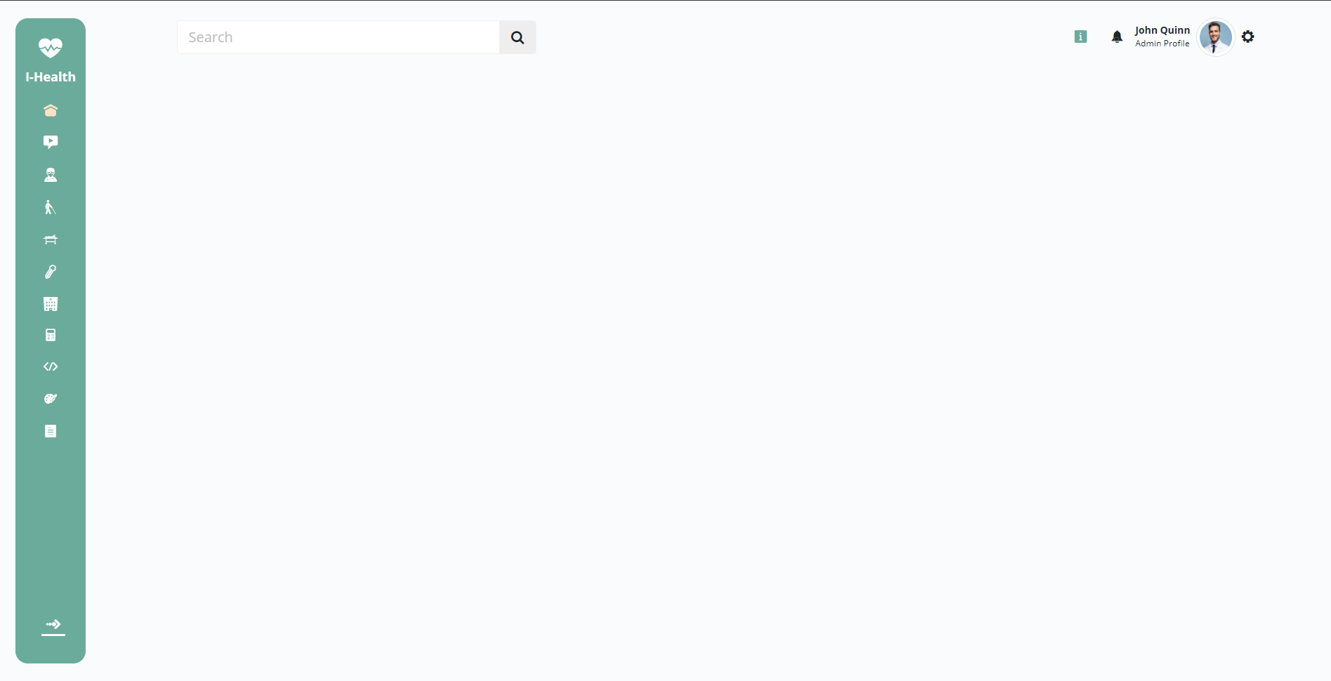
Bydefult Menu Close Code
    <div class="sidebar px-4 py-2 sidebar-mini py-md-4 me-0">
        <div class="d-flex flex-column h-100">
            <!-- Main Logo -->
            <a href="index.html" class="mb-0 brand-icon">
            </a>
            <!-- Menu: main ul -->
            <ul class="menu-list flex-grow-1 mt-3">
            </ul>
            <!-- Theme: Switch Theme -->
            <ul class="list-unstyled mb-0">
            </ul>
            <!-- Menu: menu collepce btn -->
            <button type="button" class="btn btn-link sidebar-mini-btn text-light">
                <span class="ms-2"><i class="icofont-bubble-right"></i></span>
            </button>
        </div>
    </div>
Setting info

Theme Color Setting
There are 9 Color option theme available here. just simple select your favorite color options.also sidebar gradient colorsidebar gradient color option available. just simple gradient swich on.
Dyanamic color setting
You can set your own primary colors and secondary colors also set chart color options available.just simply set your own color. click in the color box to open the color picker and choose your color
Google Font setting
There are 4 google font options. just simply select the fonts option
Light/Dark & Contrast Layout
Light: By Default Light Color Layout Theme Selected
Dark: Enable Dark Mode Swich On.
High Contrast: Enable High Contrast Mode Swich On.
RTL: Enable RTL Mode Swich On.
Comman Utilities With Custom Class
Text Color
| Class | Results |
|---|---|
.text-primary |
Lorem ipsum dolor sit amet consectecur. |
.text-secondary |
Lorem ipsum dolor sit amet consectecur. |
.text-success |
Lorem ipsum dolor sit amet consectecur. |
.text-info |
Lorem ipsum dolor sit amet consectecur. |
.text-warning |
Lorem ipsum dolor sit amet consectecur. |
.text-danger |
Lorem ipsum dolor sit amet consectecur. |
.text-dark |
Lorem ipsum dolor sit amet consectecur. |
.color-lightyellow |
Lorem ipsum dolor sit amet consectecur. |
.color-lightblue |
Lorem ipsum dolor sit amet consectecur. |
.color-light-success |
Lorem ipsum dolor sit amet consectecur. |
.color-light-orange |
Lorem ipsum dolor sit amet consectecur. |
.color-careys-pink |
Lorem ipsum dolor sit amet consectecur. |
Background Color
| Class | Results |
|---|---|
.bg-primary |
|
.bg-secondary |
|
.bg-success |
|
.bg-info |
|
.bg-warning |
|
.bg-danger |
|
.bg-dark |
|
.bg-white |
|
.bg-lightyellow |
|
.bg-lightblue |
|
.bg-careys-pink |
|
.light-success-bg |
|
.light-orange-bg |
Layouts Components
Comman Components Easy to customize by developer
Button
    <button type="button" class="btn btn-primary">Primary</button>
    <button type="button" class="btn btn-secondary">Secondary</button>
    <button type="button" class="btn btn-success">Success</button>
    <button type="button" class="btn btn-danger">Danger</button>
    <button type="button" class="btn btn-warning">Warning</button>
    <button type="button" class="btn btn-info">Info</button>
    <button type="button" class="btn btn-light">Light</button>
    <button type="button" class="btn btn-dark">Dark</button>

    <button type="button" class="btn btn-link">Link</button>
Navbar
    <nav class="navbar navbar-expand-lg navbar-light bg-light">
        <div class="container-xxl">
            <a class="navbar-brand" href="#">Navbar</a>
            <button class="navbar-toggler" type="button" data-bs-toggle="collapse" data-bs-target="#navbarSupportedContent" aria-controls="navbarSupportedContent" aria-expanded="false" aria-label="Toggle navigation">
                <span class="navbar-toggler-icon"></span>
            </button>
            <div class="collapse navbar-collapse" id="navbarSupportedContent">
                <ul class="navbar-nav me-auto mb-2 mb-lg-0">
                    <li class="nav-item"><a class="nav-link active" aria-current="page" href="#">Home</a></li>
                    <li class="nav-item"><a class="nav-link" href="#">Link</a></li>
                    <li class="nav-item dropdown">
                        <a class="nav-link dropdown-toggle" href="#" id="navbarDropdown" role="button" data-bs-toggle="dropdown" aria-expanded="false">
                            Dropdown
                        </a>
                        <ul class="dropdown-menu border-0 shadow" aria-labelledby="navbarDropdown">
                            <li><a class="dropdown-item" href="#">Action</a></li>
                            <li><a class="dropdown-item" href="#">Another action</a></li>
                            <li><hr class="dropdown-divider"></li>
                            <li><a class="dropdown-item" href="#">Something else here</a></li>
                        </ul>
                    </li>
                    <li class="nav-item"><a class="nav-link disabled" href="#" tabindex="-1" aria-disabled="true">Disabled</a></li>
                </ul>
                <form class="d-flex">
                    <input class="form-control me-2" type="search" placeholder="Search" aria-label="Search">
                    <button class="btn btn-outline-success" type="submit">Search</button>
                </form>
            </div>
        </div>
    </nav>
Breadcrumb
                <nav aria-label="breadcrumb">
                    <ol class="breadcrumb">
                        <li class="breadcrumb-item active" aria-current="page">Home</li>
                    </ol>
                </nav>

                <nav aria-label="breadcrumb">
                    <ol class="breadcrumb">
                        <li class="breadcrumb-item"><a href="#">Home</a></li>
                        <li class="breadcrumb-item active" aria-current="page">Library</li>
                    </ol>
                </nav>

                <nav aria-label="breadcrumb">
                    <ol class="breadcrumb">
                        <li class="breadcrumb-item"><a href="#">Home</a></li>
                        <li class="breadcrumb-item"><a href="#">Library</a></li>
                        <li class="breadcrumb-item active" aria-current="page">Data</li>
                    </ol>
                </nav>
Card
Card title
Card subtitle
Some quick example text to build on the card title and make up the bulk of the card's content.
Card link Another link
            <div class="card" style="width: 18rem;">
                <div class="card-body">
                    <h5 class="card-title">Card title</h5>
                    <h6 class="card-subtitle mb-2 text-muted">Card subtitle</h6>
                    <p class="card-text">Some quick example text to build on the card title and make up the bulk of the card's content.</p>
                    <a href="#" class="card-link">Card link</a>
                    <a href="#" class="card-link">Another link</a>
                </div>
            </div>
Advantages
- Very easy access to any starters components and core settings from anywhere in the template.
- Intuitive clear architecture.
- Avoiding the probabilities of conflicts between Front codes and third party plugins (libraries).
- Creation of wrapper components simply solves complicated initializations structures for the users.
- Everything is structured, each component in its own file and in its component in the main object.
- The ability of extending functionality without affecting the behavior of the core object and not changing the existing functionality.
Hospital Management Template Credit
| Google font | https://fonts.google.com/ |
| Bootstrap | https://v5.getbootstrap.com/ |
| Jquery | https://jquery.com/ |
| SASS | https://sass-lang.com/ |
| Grunt | https://gruntjs.com/ |
| NPM | https://www.npmjs.com/ |
| Fontawesome | https://fontawesome.com/v4.7.0/ |
| Icon Font | https://icofont.com/icons |
| Apex Charts | https://apexcharts.com/ |
| Sparkline Charts | https://omnipotent.net/jquery.sparkline/#s-about |
| Fullcalendar | https://fullcalendar.io/ |
| Pexels | https://www.pexels.com/ |